
Signage is an affordable way to advertise your business. There’s more to designing signage for both outdoors and indoors than can meet the eye. A lot of people don’t realize that there are a lot of factors that go should be thought about before and during the design process to get signage that fits your brand and appeals to your audience. These design principles are used by graphic professionals to create attractive, high impact signage that is readable, visually pleasing, and high-impact.
This is a contributed post. Please refer to my disclosure for more information.
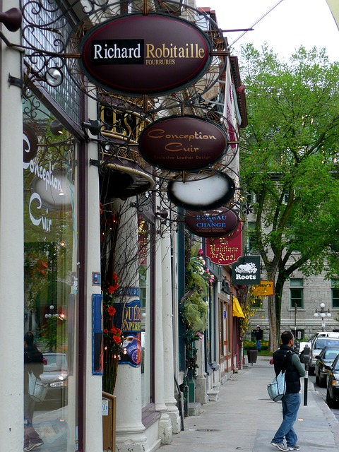
Keep It Visible And Legible
Remember that less is more. Keep your messages short so your sign is easier to see and read at a glance, even by people just passing by. Signs can come in every shape and size, so be sure to choose a size that is appropriate for the space you have and the distance that you expect your sign to be seen from. For example, halo illuminated signs of your logo should be large so people can see it from the main door. Menus in the window can be smaller, as the people viewing them are stood right next to them. Where will your sign be located and what obstacles might be in the way? Visibility is important.
Avoid Clutter
Signage that works will communicate your message concisely. Convey your message in as few words as possible. A sign crowded with too many words or lines of texts makes it harder to read from a distance.
Leave white space. This is an area in the design that is left blank (although it doesn’t need to be white). This empty space is as important as other parts of your design. People often want to fill up the available space with as much copy as you can. When text is crowded, it’s more difficult to read. Leave white space for readability.
Types And Fonts
In most cases, type styles that are clean, crisp and easy-to-read should be used for your signage to make them as legible as possible. Most professional fonts come in varying weights, ranging from regular to bold, black, extended, and so on. Use these variants to your advantage by using them to give priority or preference to some parts of your message.
A common misconception is that all capital letters are larger than lower case letters, there are easier to read from a distance. In fact, visual tests show that upper and lower case text is the most legible from a distance, rather than all upper case. As viewers might only have a quick glance to understand your message, you should make your signs more readable by not overdoing it with the capital letters.
As a general rule of design, you shouldn’t use more than two different fonts in one design. Choose two fonts that work well together and use them to make your message stand out. The most important thing is to use fonts that are easy to read and clearly legible, even when looked at from a distance.
What To Read Next
4 Lessons That 2020 Taught Start-ups
How To Avoid A Business Downturn In 2020 Using Influencer Marketing